2.4. Exploratory Analysis
PiML supports three types of plots for exploratory analysis: univariate plots, bivariate plots, and multivariate plots.
2.4.1. Univariate Plots
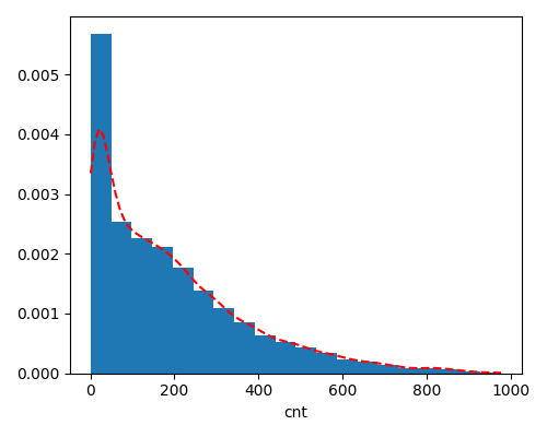
PiML allows for a visual exploration of the data distribution and the identification of potential outliers. These visualizations aid in understanding the range of values, detecting deviations from the expected patterns, and assessing the presence of outliers in the numerical feature space. The univariate shows the marginal distribution of a single feature.
Numerical Feature: We show the density and histogram charts for a numerical feature.
exp.eda(show='univariate', uni_feature='cnt', figsize=(5, 4))
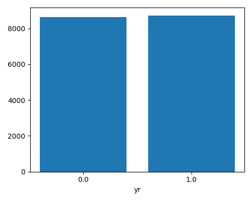
Categorical Feature: We show the bar chart that displays the frequency of each category.
exp.eda(show='univariate', uni_feature='yr', figsize=(5, 4))
2.4.2. Bivariate Plots
The bivariate plot is a graphical representation that displays the relationship between two variables. We use three types of charts for different combinations of feature types.
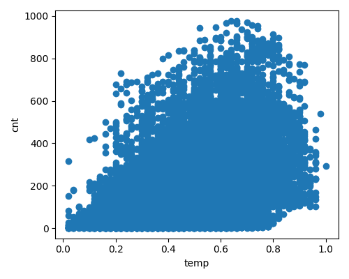
Numerical & Numerical: We use the scatter plot to show the relationship between two variables as a collection of points on a two-dimensional graph.
exp.eda(show='bivariate', bi_features=['temp', 'cnt'], figsize=(5, 4))
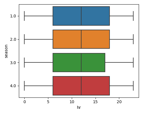
Numerical & Categorical: We use the box plot to show the relationship by displaying the numerical feature distribution conditional on each category of the categorical feature.
exp.eda(show='bivariate', bi_features=['hr', 'season'], figsize=(5, 4))
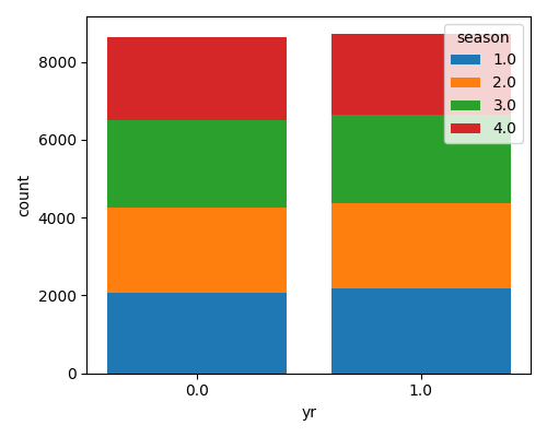
Categorical & Categorical: We use the stack bar plot, each bar represents a category in one variable and is divided into segments representing the frequency of the second variable within that category.
exp.eda(show='bivariate', bi_features=['yr', 'season'], figsize=(5, 4))
2.4.3. Multivariate Plots
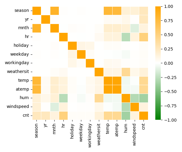
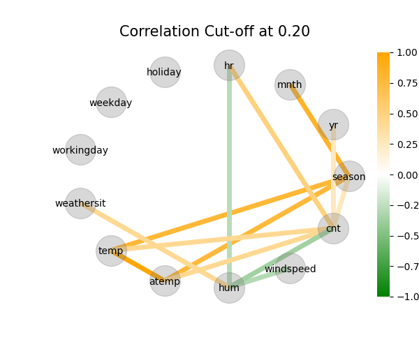
There are two types of multivariate charts in PiML: correlation heatmap and correlation graph. Both the correlation heatmap and correlation graph display the pairwise correlations.
The correlation calculation methods used in these charts are the same as those used for data quality checks. For more detailed information, please refer to the integrity_check.
Correlation Heatmap: This heatmap displays the correlation matrix using heatmap directly.
exp.eda(show='multivariate', multi_type='correlation_heatmap', figsize=(6, 5))
Correlation Graph: This is an alternative plot to the correlation heatmap, where we use nodes to represent features and connecting lines to show the correlation coefficients.
exp.eda(show='multivariate', multi_type='correlation_graph', figsize=(6, 5))
2.4.4. Examples
The full example codes of this section can be found in the following link.
