7.2. Comparison for Classification
This section describes how different classification models with binary responses can be compared based on different metrics. In PiML, this can be done by using the model_compare function. We use results from the TaiwanCredit data for illustration.
7.2.1. Accuracy Comparison
The metric can be chosen from “ACC”, “AUC”, “F1”, “LogLoss”, and “Brier”.
7.2.1.1. Accuracy Score
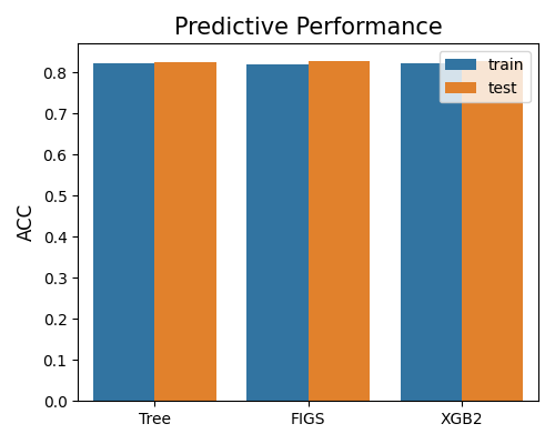
The bar chart below compares models based on ACC score, with metric = “ACC”. As the legend indicates, the plot compares the models on training and testing data. The results indicate that these three models have similar performance.
exp.model_compare(models=["Tree", "FIGS", "XGB2"], show="accuracy_plot", metric="ACC")
7.2.1.2. AUC Score
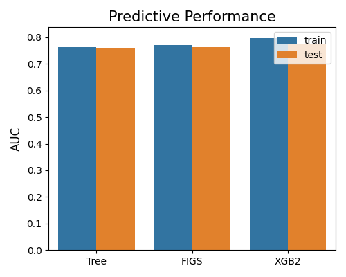
The second plot compares models based on AUC score, with metric = “AUC”. The results indicate that the XGB2 model has slightly better performance.
exp.model_compare(models=["Tree", "FIGS", "XGB2"], show="accuracy_plot", metric="AUC")
7.2.1.3. F1 Score
The last plot compares modes based on the F1 score, with metric = “F1”. All these three models have similar performance under this metric.
exp.model_compare(models=["Tree", "FIGS", "XGB2"], show="accuracy_plot", metric="F1")

7.2.2. Overfit Comparison
The overfit comparison presents the overfit regions of various models in relation to a specific feature of interest. The algorithm for detecting overfit regions can be found in the “overfit” section. It is important to note that unlike the overfit for a single model, the argument used for selecting slicing features is slice_feature (instead of slice_features). This argument is a string that represents the name of the feature. Here is an example that demonstrates how to compare the overfit regions of different models using the keyword “overfit”.
exp.model_compare(models=["Tree", "FIGS", "XGB2"], show="overfit",
                  slice_method="histogram", slice_feature="PAY_1",
                  bins=10, metric="ACC", figsize=(5, 4))
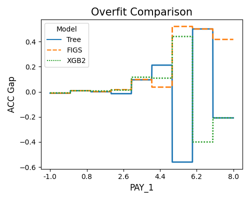
The first plot uses the “histogram” slicing method, and the number of bins is set to 10. The slicing feature is PAY_1. The results reveal that the Tree model is overfitting (Test - Train ACC Gap < 0) when PAY_1 is within 5 to 6 and 7 to 8. The XGB2 model also overfits as PAY_1 is greater than 6.
exp.model_compare(models=["Tree", "FIGS", "XGB2"], show="overfit",
                  slice_method="histogram", slice_feature="PAY_1",
                  metric="AUC", original_scale=True, figsize=(5, 4))
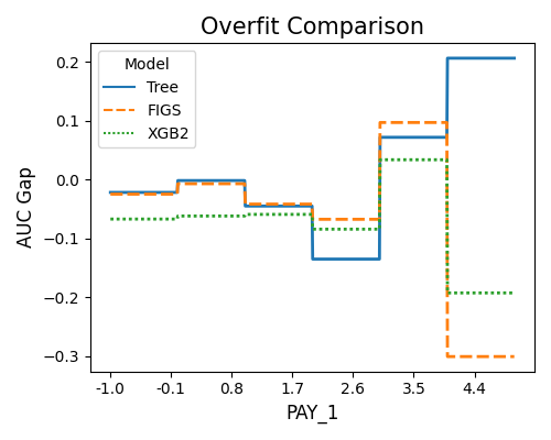
The second plot displays the overfitting detection results using AUC as the target metric.
7.2.3. Reliability Comparison
For binary classification tasks, the reliability comparison includes bandwidth comparison and reliability diagram comparison.
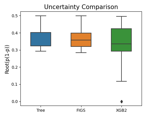
7.2.3.1. Bandwidth Comparison
The prediction interval bandwidth for binary classification is quantified by the squared root of \(\hat{p}(1 - \hat{p})\), and hence the argument alpha is not used. The example below illustrates how to compare models’ prediction interval bandwidth.
exp.model_compare(models=["Tree", "FIGS", "XGB2"], show="reliability_bandwidth", figsize=(5, 4))
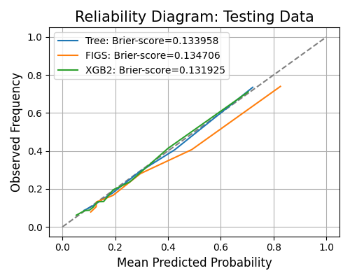
7.2.3.2. Reliability Diagram Comparison
The keyword for the reliability diagram is “reliability_perf”, and it generates a reliability diagram for each model, as shown below. The argument bins is the number of bins of predicted probability, used for calculating the calibrated probability using the actual label.
exp.model_compare(models=["Tree", "FIGS", "XGB2"], show="reliability_perf",
                  bins=10, figsize=(5, 4))
7.2.4. Robustness Comparison
Robustness comparison is to compare models under input perturbation. The algorithm details of the robustness test can be found in the robustness testing section.
7.2.4.1. Robustness Performance
The example below demonstrates the comparison of models’ robustness performance using the “robustness_perf” keyword. In this scenario, the perturbation method defaults to “raw”, which involves adding normal noise to the numerical features. The perturbation for categorical features can be found in the robustness section. By default, all features undergo perturbation unless otherwise specified. The performance metric used for this comparison is defaulted to “AUC”.
exp.model_compare(models=["Tree", "FIGS", "XGB2"], show="robustness_perf",
                  figsize=(5, 4))
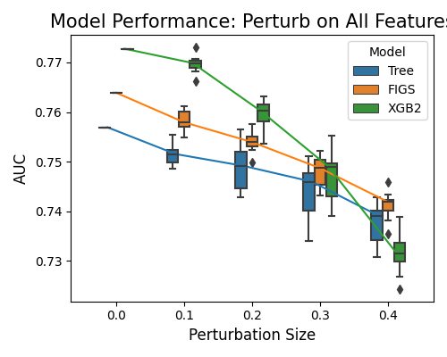
In the plot above, the perturbation is applied to all variables. On the x-axis, we have the perturbation size, and on the y-axis, the model performance. FIGS recorded the best robustness performance, followed by Tree. The worst performing is XGB2.
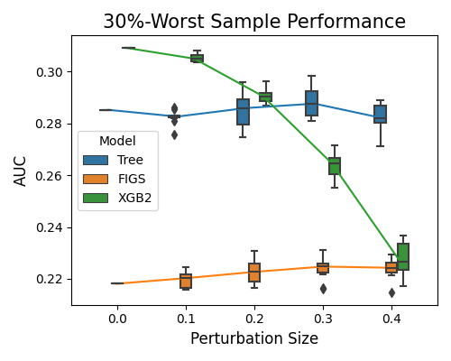
7.2.4.2. Robustness Performance on Worst Samples
The keyword “robustness_perf_worst” is used to evaluate the models’ performance against perturbation size based on the worst sample. For this option, in addition to the arguments metric, perturb_method, perturb_size, and perturb_features, we have an additional argument alpha, which is the proportion of worst samples to consider.
exp.model_compare(models=["Tree", "FIGS", "XGB2"], show="robustness_perf_worst",
                  alpha=0.3, figsize=(5, 4))
7.2.5. Resilience Comparison
Resilience comparison is to compare models under distribution shift. The algorithm details of the resilience test can be found in the resilience testing section.
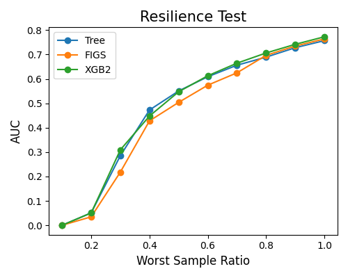
7.2.5.1. Resilience Performance
The example below illustrates how to compare models’ resilience performance using the keyword “resilience_perf”. The perturbation method is set to “worst-sample”. The performance metric is set to “AUC”.
exp.model_compare(models=["Tree", "FIGS", "XGB2"], show="resilience_perf",
                  resilience_method="worst-sample", immu_feature=None, metric="AUC", figsize=(5, 4))
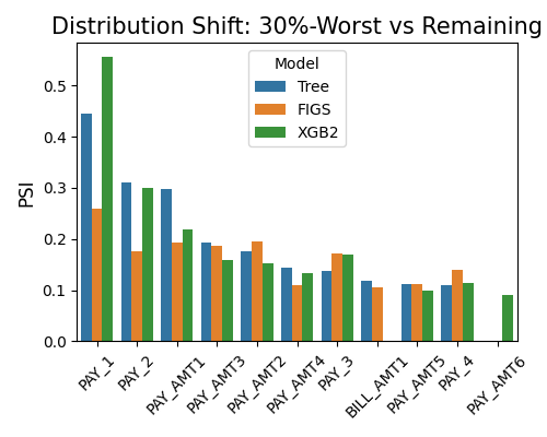
7.2.5.2. Resilience Distance
By setting show to “resilience_distance”, the distributional distance between the worst test sample and the remaining test sample will be calculated for each feature. Then the features will be ranked by distance, and the top 10 features with the largest distances will be displayed.
exp.model_compare(models=["Tree", "FIGS", "XGB2"], show="resilience_distance",
                  resilience_method="worst-sample", metric="AUC", alpha=0.3, figsize=(5, 4))