6.6. Resilience
The resilience test aims to evaluate the performance sustainability of a model when faced with changing input distributions. This testing is crucial for verifying a model’s capability to handle unexpected scenarios that deviate from its training data. Moreover, resilience testing facilitates the identification of potential areas for model enhancement. At PiML, we provide diverse out-of-distribution scenarios to assess a model’s resilience.
6.6.1. Algorithm Details
We have incorporated four distinct out-of-distribution scenarios into our implementation, outlined as follows:
Worst sample: First, we compute the residual of each sample in the test set. For binary classification tasks with metrics such as “AUC” or “F1”, we utilize the predicted probability. Next, we sort the residuals in descending order based on their absolute values. By doing so, we can select the samples with the highest residuals as the worst samples. It is important to note that the worst samples are specific to the model under evaluation and can differ significantly between different models.
Hard sample: To determine the worst samples in a more refined manner, we employ a method that involves using a surrogate model to rank the difficulty or likelihood of poor performance for each sample, as follows:
Fit a sophisticated XGBoost model (referred to as XGB-A) using the training data.
Evaluate the performance of XGB-A and identify the worst 30% of samples from the test set.
Assign a label of 1 to these identified worst test samples, while assigning a label of 0 to the remaining test samples.
Fit another XGBoost classifier (referred to as XGB-B) using the dataset created in the previous step, which includes the marked worst samples.
Utilize XGB-B as a surrogate model to rank the difficulty or hardness of the samples, with higher predicted probabilities indicating harder samples.
It is important to note that in this particular scenario, the worst samples remain consistent across different models, implying that they are independent of the specific model being evaluated.
Outer sample: The surrogate of worstness is determined by measuring the Euclidean distance of each test sample to the mean of features in the training set. Samples displaying significant distances from the mean are marked as outer samples, indicating their deviation from the training data distribution. It is important to note that these outer samples are model agnostic, meaning they hold the same significance across different models.
Worst cluster: We apply the K-means clustering algorithm using the features of the training data (\(K=2,\ldots,10\)). By clustering the training data, we can group similar samples based on their feature similarity. Next, we evaluate the performance of each cluster on the test set. The cluster with the worst performance, indicating poorer model performance within that cluster, is selected as the worst sample. It is important to note that the identification of the worst samples is indeed related to the specific models being evaluated. Therefore, the worst samples can differ depending on the model used.
In addition, the first three scenarios can be used accompanied by an immutable feature. That is, we perform equal-quantile binning on the immutable feature. Subsequently, we select the worst samples within each bin, allowing us to focus on the samples that exhibit the poorest performance while controlling for the effect of the specific feature. For example, if the immutable feature is age, we can select the e.g., top 20% worst samples within each age group. Note that the worstness score is first computed for all the test data before segmentation.
6.6.2. Usage
The model_diagnose function provides a comprehensive resilience test, offering four different plots: “resilience_perf”, “resilience_distance”, “resilience_shift_density”, and “resilience_shift_histogram”.
To customize the resilience test, the following parameters can be specified:
resilience_method: This parameter determines the method for selecting the worst samples. The options include “worst-sample” (default), “hard-sample”, “outer-sample”, and “worst-cluster”.immu_feature: When selecting the worst samples, this parameter allows you to specify an immutable feature. The default value is None.metric: You can choose the performance metric for evaluation. Supported metrics include “ACC”, “AUC”, “F1”, “LogLoss”, and “Brier” for binary classification, and “MSE”, “MAE”, and “R2” for regression tasks.distance_metrics: This parameter determines the distance metric used to compare the worst test sample with the entire test sample. Available options include “PSI”, “WD1”, and “KS”, and more details can be found in the documentation here.alpha: When theresilience_methodis set to “worst-sample”, “hard-sample”, or “outer-sample”, this parameter specifies the worst-sample ratio. The values range from 0.1 to 1.0, incrementing by 0.1. It is used in conjunction with the “resilience_distance”, “resilience_shift_density”, or “resilience_shift_histogram” plots.n_clusters: When theresilience_methodis set to “worst-cluster”, this parameter determines the number of clusters to be considered. You may choose a value from 1 to 10. It is used in conjunction with the “resilience_distance”, “resilience_shift_density”, or “resilience_shift_histogram” plots.psi_buckets: This parameter defines the binning method for calculating the PSI (Population Stability Index) value.
By customizing these parameters, you can tailor the resilience test according to your specific requirements and gain valuable insights into the model’s performance. In this demonstration, we will train an XGB2 model using the TaiwanCredit dataset.
6.6.2.1. Resilience Performance
With the resilience test, you can assess the performance of the worst samples in a model across various out-of-distribution scenarios. The plot specifically designed for this purpose is denoted by the keyword “resilience_perf.”
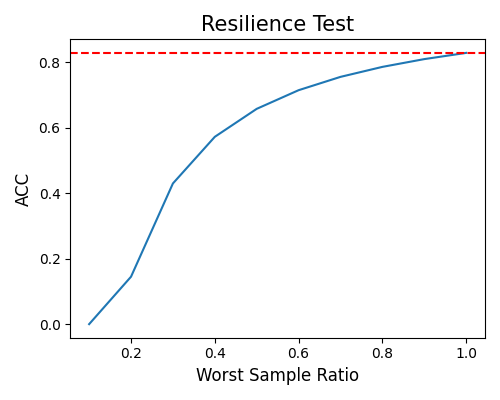
worst-sample: The following example demonstrates the model’s performance in the “worst-sample” scenario, considering varying worst sample ratios ranging from 0.1 to 1.0. A ratio of 1.0 implies that all test samples are treated as worst samples, while a ratio of 0.1 signifies that only 10% of the test samples are considered as worst samples. In the plot, the red dotted line represents the model’s performance on the entire test sample. The curve depicted in the plot is monotonic, indicating that as the worst sample ratio increases, the model’s performance tends to decrease. This visualization allows for a clear understanding of how the model’s performance varies when different proportions of worst samples are considered.
exp.model_diagnose(model="XGB2", show="resilience_perf", resilience_method="worst-sample",
                   figsize=(5, 4))
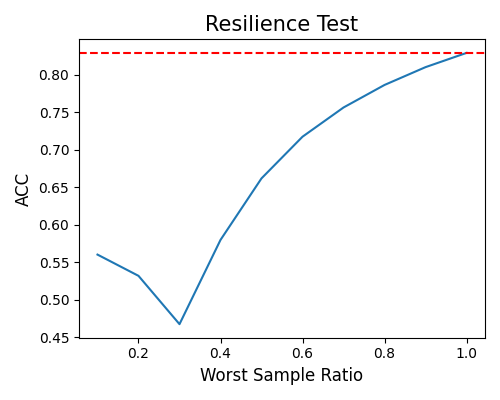
hard-sample: As the worst sample ratio decreases to less than 0.4, the ACC values hover around 0.5. This observation indicates that the model’s performance is comparable to that of a random classifier. However, as the worst sample ratio increases, there is a noticeable improvement in the model’s performance.
exp.model_diagnose(model="XGB2", show="resilience_perf", resilience_method="hard-sample",
                   figsize=(5, 4))
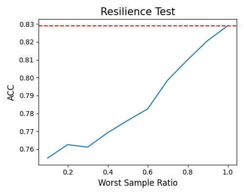
outer-sample: The fluctuations in performance observed at different worst sample ratios highlight the complexity of assessing the worst samples in unsupervised scenarios. The model’s performance may be influenced by various factors, including the characteristics of the data and the specific criteria used to define the “worst” samples.
exp.model_diagnose(model="XGB2", show="resilience_perf", resilience_method="outer-sample",
                   figsize=(5, 4))
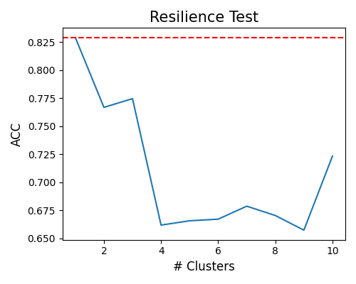
worst-cluster: The last scenario, known as the “worst-cluster” method, introduces a slight variation compared to the previous methods. In this method, the x-axis of the plot represents the number of clusters, ranging from 1 to 10. The approach involves adjusting the value of \(K\) in the K-means algorithm and identifying the worst cluster as the worst sample. The worst cluster is determined based on the lowest performance metric observed within the clusters. It is important to note that when \(K=1\), it represents the entire test sample as a single cluster.
exp.model_diagnose(model="XGB2", show="resilience_perf", resilience_method="worst-cluster",
                   figsize=(5, 4))
6.6.2.2. Resilience Distance
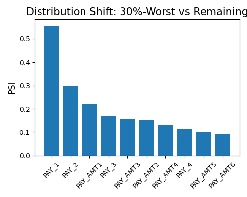
By setting show to “resilience_distance”, the distributional distance between the worst test sample and the remaining test sample will be calculated for each feature. Then the features will be ranked by distance, and the top 10 features with the largest distances will be displayed.
In the first example, we set the distance_metrics to “PSI”, and you can also use “WD1” and “KS” instead. The worst sample ratio alpha is set to 0.3. The plot suggests the variable Pay_1 has the largest PSI (around 0.55), which is usually thought of as a significant distribution change.
exp.model_diagnose(model="XGB2", show="resilience_distance", resilience_method="worst-sample",
                   distance_metric="PSI", alpha=0.3, figsize=(5, 4))
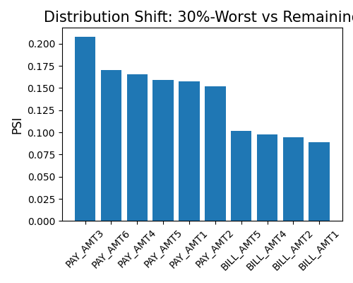
In the second example, we still use the same setting, but with immu_feature not None. By conditioning on PAY_1, we recalculate the resilience distance. It can be found that the PSI distance of that immutable feature becomes much smaller.
exp.model_diagnose(model="XGB2", show="resilience_distance", resilience_method="worst-sample",
                   distance_metric="PSI", immu_feature="PAY_1", alpha=0.3, figsize=(5, 4))
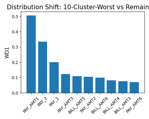
The third example shows the resilience distance plot for the “worst-cluster” scenario. The n_clusters is set to 10, and the distance_metrics is set to “WD1”. The plot suggests the variable Pay_1 has the largest WD1 (0.12), which is usually thought of as a moderate distribution change.
exp.model_diagnose(model="XGB2", show="resilience_distance", resilience_method="worst-cluster",
                   distance_metric="WD1", n_clusters=10, figsize=(5, 4))
6.6.2.3. Marginal Density Comparison
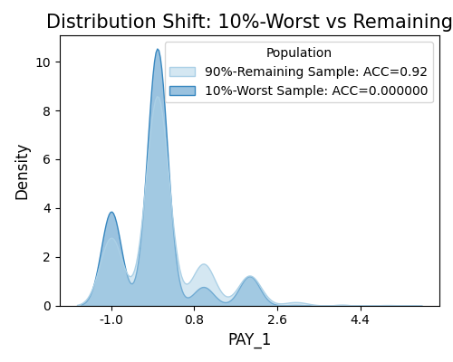
The marginal density plot shows the distributional difference between the worst test samples and remaining test samples for a single feature. To generate this plot, set show to “resilience_shift_density”, and also specify the show_feature to be plotted.
exp.model_diagnose(model="XGB2", show="resilience_shift_density",
                   show_feature="Pay_1", original_scale=True, figsize=(5, 4))
6.6.2.4. Marginal Histogram Comparison
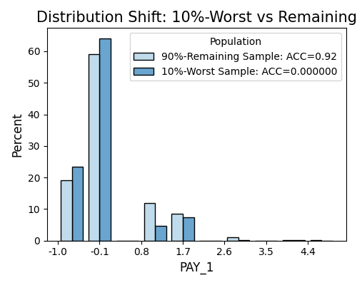
Similar to the density plot, we also provide the option to draw the histogram comparison of the worst test samples and remaining test samples for a single feature, by using the keyword “resilience_shift_histogram”.
exp.model_diagnose(model="XGB2", show="resilience_shift_histogram",
                   show_feature="Pay_1", original_scale=True, figsize=(5, 4))
