7.1. Comparison for Regression
In this section, we will explore the comparison of various regression models using different metrics. PiML offers a convenient way to perform this comparison through the model_compare function. To illustrate this process, we will utilize the results obtained from the BikeSharing dataset.
7.1.1. Accuracy Comparison
The accuracy comparison can be generated using the keyword “accuracy_plot”. The supported performance metrics include “MSE”, “MAE”, and “R2”.
7.1.1.1. Mean Squared Error
First of all, we need to specify the models to be compared, by the parameter models, which is a list of model names. We suggest limiting the number of models to 3 so that the plot is not too crowded. In this example, we compare the performance of GLM, XGB2, and XGB7. The metric for comparison is set to “MSE” by the parameter metric. The following code generates the accuracy comparison plot for These three models.
exp.model_compare(models=["GLM", "XGB2", "XGB7"], show="accuracy_plot",
                  metric="MSE", figsize=(5, 4))
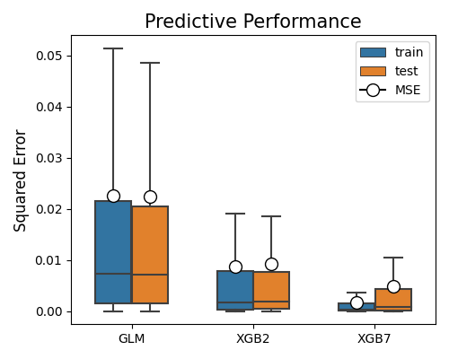
The boxplots summarize the squared errors for each model on training and testing data. The mean squared error (MSE) is marked using the circle. The lower the MSE, the better the model. In this example, XGB7 has the lowest MSE on the test set, followed by XGB2 and GLM. The relative performance of the three models is the same in the training set.
7.1.1.2. Mean Absolute Error
By changing the metric parameter to “MAE”, the mean absolute error will be displayed.
exp.model_compare(models=["GLM", "XGB2", "XGB7"], show="accuracy_plot",
                  metric="MAE", figsize=(5, 4))
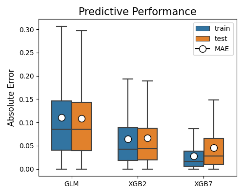
The MSE metric is more sensitive to outliers compared to MAE. However, in this example, both metrics lead to the same conclusions. The absolute errors are significantly larger than the squared errors, as all absolute errors are less than 1.
7.1.1.3. R-squared Score
Similarly, the R-squared (R2) score can be used by setting metric to “R2”. The R2 score is a normalized metric, which is between 0 and 1 for the training set. The higher the R2 score, the better the model.
exp.model_compare(models=["GLM", "XGB2", "XGB7"], show="accuracy_plot",
                  metric="R2", figsize=(5, 4))
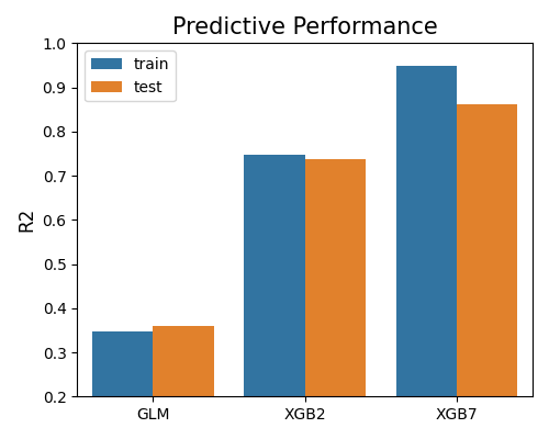
The bar chart presented above illustrates the comparison of models using the R2 metric. It is important to note that since there is only one R2 score for the entire dataset, the box plots are not used. Furthermore, the conclusions derived from R2 are consistent with those obtained from MSE and MAE metrics.
7.1.2. Overfit Comparison
The overfit comparison presents the overfit regions of various models in relation to a specific feature of interest. The algorithm for detecting overfit regions can be found in the “overfit” section. It is important to note that unlike the overfit for a single model, the argument used for selecting slicing features is slice_feature (instead of slice_features). This argument is a string that represents the name of the feature. Here is an example that demonstrates how to compare the overfit regions of different models using the keyword “overfit”.
exp.model_compare(models=["GLM", "XGB2", "XGB7"], show="overfit",
                  metricmetric="MSE", slice_method="histogram", bins=10,
                  slice_feature="hr", figsize=(5, 4))
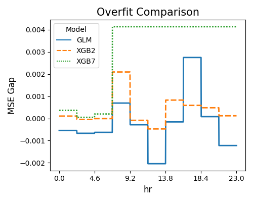
The first plot uses the “histogram” slicing method, and the number of bins is set to 10. The slicing feature is hr. The results reveal that the XGB7 model suffers more from the overfitting issue (Test - Train MSE Gap > 0) compared to GLM and XGB2, especially for hr larger than 4.6.
exp.model_compare(models=["GLM", "XGB2", "XGB7"], show="overfit",
                  slice_method="histogram", slice_feature="hr",
                  metric="MAE", figsize=(5, 4))
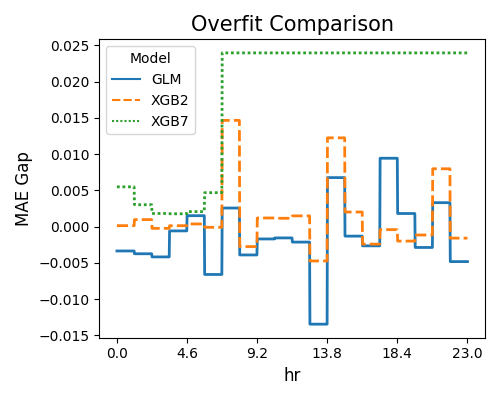
The second plot displays the overfitting detection results using R2 as the target metric.
7.1.3. Reliability Comparison
The reliability comparison aims to assess the uncertainty of model predictions. The algorithmic details can be found in the reliability section.
7.1.3.1. Coverage Comparison
The example below illustrates how to check the coverage ratio of the prediction intervals.
exp.model_compare(models=["GLM", "XGB2", "XGB7"], show="reliability_bandwidth",
                  alpha=0.1, figsize=(5, 4))
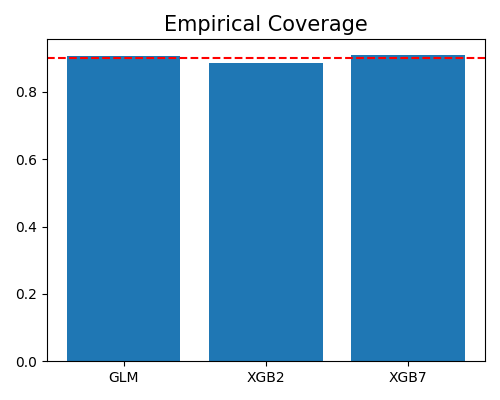
The argument alpha is set to 0.1, which means the expected coverage is 90%, marked by the dotted line. All these three models have a coverage ratio close to 90%, which means that the prediction intervals are reliable.
7.1.3.2. Bandwidth Comparison
By setting the parameter show to “reliability_coverage”, we can generate an average coverage comparison plot for the prediction intervals on the randomly selected 40% test set. The argument alpha represents the expected proportion of samples that are expected to fall outside the estimated prediction intervals.
exp.model_compare(models=["GLM", "XGB2", "XGB7"], show="reliability_coverage",
                  alpha=0.1, figsize=(5, 4))
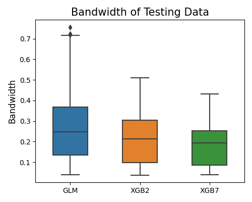
This plot shows that XGB7 has the smallest bandwidth of prediction intervals, which means that the prediction of XGB7 is more certain than that of XGB2 and GLM.
7.1.4. Robustness Comparison
Robustness comparison is to compare models under input perturbation. This section illustrates how to compare models under input perturbation. The algorithm details of the robustness test can be found in the robustness testing section.
7.1.4.1. Robustness Performance
The example below demonstrates the comparison of models’ robustness performance using the “robustness_perf” keyword. In this scenario, the perturbation method defaults to “raw”, which involves adding normal noise to the numerical features. The perturbation for categorical features can be found in the robustness section. By default, all features undergo perturbation unless otherwise specified. The performance metric used for this comparison is “MSE”.
exp.model_compare(models=["GLM", "XGB2", "XGB7"], show="robustness_perf",
                  metric="MSE", figsize=(5, 4))
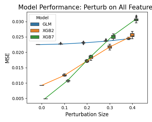
In the plot above, the perturbation is applied to all variables. On the x-axis, we have the perturbation size, and on the y-axis, the model performance. Model XGB7 recorded the worst robustness performance, which shows significant performance degradation under perturbation. The GLM model only shows a slight MSE increase from the perturbation.
7.1.4.2. Robustness Performance on Worst Samples
The keyword “robustness_perf_worst” is employed to assess the worst sample performance of models against perturbation size. In addition to the arguments metric, perturb_method, perturb_size, and perturb_features, there is an extra argument called alpha, which represents the proportion of worst samples to be taken into consideration. Here is an example that demonstrates how to compare the robustness performance of models on worst samples:
exp.model_compare(models=["GLM", "XGB2", "XGB7"], show="robustness_perf_worst",
                  alpha=0.3, figsize=(5, 4))
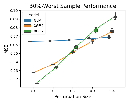
The relative performance of the worst sample robustness results is consistent with the previous one, but the MSE scale is much larger.
7.1.5. Resilience Comparison
Resilience comparison is to compare models under distribution shift. The algorithm details of the resilience test can be found in the resilience testing section.
7.1.5.1. Resilience Performance
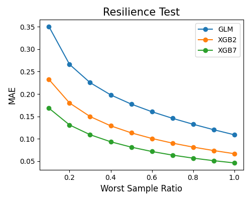
The example below illustrates how to compare models’ resilience performance using the keyword “resilience_perf”. The perturbation method is set to “worst-sample”. The performance metric is set to “MAE”.
exp.model_compare(models=["GLM", "XGB2", "XGB7"], show="resilience_perf",
                  resilience_method="worst-sample", immu_feature=None, metric="MAE", figsize=(5, 4))
7.1.5.2. Resilience Distance
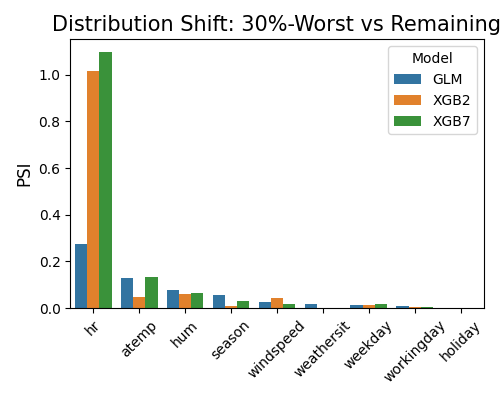
By setting show to “resilience_distance”, the distributional distance between the worst test sample and the remaining test sample will be calculated for each feature. Then the features will be ranked by distance, and the top 10 features with the largest distances will be displayed.
exp.model_compare(models=["GLM", "XGB2", "XGB7"], show="resilience_distance",
                  resilience_method="worst-sample", metric="MAE", alpha=0.3, figsize=(5, 4))
