6.4. Reliability
The reliability test aims to provide an estimation of prediction uncertainty, which is crucial in understanding the reliability and confidence of model predictions. In PiML, the model_diagnose function can be used to evaluate the reliability of fitted models. In particular, we have incorporated different methods to assess the reliability of models for regression and binary classification tasks, respectively.
6.4.1. Reliability for Regression Tasks
Conformalized residual quantile regression (CRQR) is a model-agnostic approach for assessing the reliability of regression models. It operates within the framework of conformal prediction, assuming that validation samples are interchangeable with testing samples. The CRQR method can be applied to any model denoted as \(\hat{f}(x)\). Its definition is as follows:
Fit a quantile regression model \(\hat{g}_{\alpha}(x)\) to predict the residuals \(y_{i}-\hat{f}(x_{i})\) of training data.
Define the conformal score for the residual \(\epsilon_{i}=y_{i}-\hat{f}(x_{i})\):
Compute the \(\frac{(⌈(n+1)(1-\alpha)⌉)}{n}\)-quantile of the calibrated scores \({s_{1},\ldots,s_{n}}\).
For a testing sample \(x_{test}\), construct the confidence interval to be:
In PiML, the test set is further divided into three subsets for different purposes. The first subset, comprising 40% of the test set, is used to train the quantile regression model. The second subset, which accounts for 20% of the test set, is employed for calibration. The remaining 40% of the test set is dedicated to evaluating the quality of prediction intervals. In this process, we utilize the HistGradientBoostingRegressor quantile regression model from the sklearn library, with the max depth parameter set to 5. If the version of sklearn is below 1.1, the raw GBDT model is utilized instead.
6.4.1.1. Coverage and Bandwidth Table
To demonstrate the process, we utilize an XGB2 model on the BikeSharing dataset. By setting the show parameter to “reliability_table”, we can obtain the average coverage and bandwidth of the prediction intervals on the test set. In this context, the alpha argument represents the desired proportion of samples that should fall outside the prediction intervals.
exp.model_diagnose(model="XGB2", show="reliability_table", alpha=0.1)
The results is a table showing a) the coverage of the prediction intervals, which should be close to the predefined level of 90% (1 - alpha=0.1); b) the average bandwidth of the prediction intervals, which serves as a measure of the prediction uncertainty. Smaller bandwidth values indicate more precise and reliable predictions.
6.4.1.2. Distance of Reliable and Un-reliable Data
In PiML, we can delve deeper into the analysis of model uncertainty by examining the relationship between each feature and the reliability of predictions. This can be accomplished by calculating the distance between reliable and unreliable data points. To clarify, let’s define reliable and unreliable data as follows:
Reliable data: This refers to samples whose prediction interval width is less than a predefined threshold.
Unreliable data: This includes samples with a prediction interval width greater than or equal to the predefined threshold.
After obtaining reliable and unreliable data based on the defined threshold, the next step is to compare the differences between these two groups. This is achieved by calculating the feature-wise distributional distance between the samples belonging to the reliable and unreliable groups.
By setting the show parameter to “reliability_distance”, we can obtain the distribution shift distance of features between reliable and unreliable data. It is important to specify the expected coverage level (alpha) as well. Additionally, the following arguments are relevant to this analysis:
threshold: This parameter determines the threshold ratio that distinguishes reliable data from unreliable data based on the width of prediction intervals. For instance, if we set the threshold to 1.1, the threshold for the bandwidth would be calculated as 1.1 multiplied by 0.233, resulting in a threshold of 0.2563.distance_metrics: This parameter determines the distance metric used to compare the worst test sample with the full test sample. Available options include “PSI” (default), “WD1”, and “KS”.psi_buckets: It denotes the binning method employed for calculating the PSI (Population Stability Index) value, which can be either “uniform” (default) or “quantile”.
exp.model_diagnose(model="XGB2", show="reliability_distance", alpha=0.1,
                   threshold=1.1, distance_metric="PSI", figsize=(5, 4))
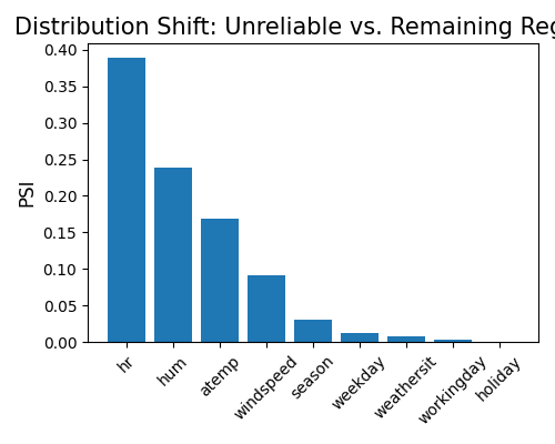
Based on the above figure, it is evident that the distributional distance of the feature hr is the largest when comparing reliable and unreliable data. However, it is important to note that this result merely suggests a relationship between the feature hr and model uncertainty. It does not allow us to draw conclusions regarding causality. The observed association may be indicative of a correlation, but further analysis is necessary to establish any causal relationship.
6.4.1.3. Marginal Bandwidth
To analyze the bandwidth against each feature, we can utilize the “reliability_marginal” option of the show parameter. This will provide us with the average width of prediction intervals for the individual feature of interest, by specifying the show_feature argument. Additionally, the bins argument allows us to determine the number of bins to discretize the feature. Similar to the previous plots, it is necessary to define the values for alpha and threshold in order to obtain meaningful results.
exp.model_diagnose(model="XGB2", show="reliability_marginal", alpha=0.1,
                   show_feature="hr", bins=10, threshold=1.1,
                   original_scale=True, figsize=(5, 4))
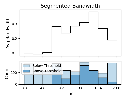
In the plot above, we can see that the marginal bandwidth of hr exceeds the threshold (red dotted line) specifically during rush hours. This observation aligns with the findings from the weakspot tests, further supporting the notion that the feature hr is associated with increased model uncertainty during these specific time periods.
6.4.2. Reliability for Binary Classification
In PiML, the reliability assessment for binary classification tasks is currently under development and not yet fully mature. As a temporary approach, we utilize the formula \(\sqrt{\hat{p}(1-\hat{p})}\) to quantify the uncertainty associated with each prediction. Additionally, isotonic regression is employed to calibrate the predicted probabilities. The reliability diagram is used to visually illustrate the calibration of the predicted probabilities, showing how well they align with the observed frequencies. The Brier score, on the other hand, is utilized to quantify the accuracy of the predicted probabilities by calculating the mean squared difference between the predicted probabilities and the actual outcomes.
6.4.2.1. Distance of Reliable and Un-reliable Data
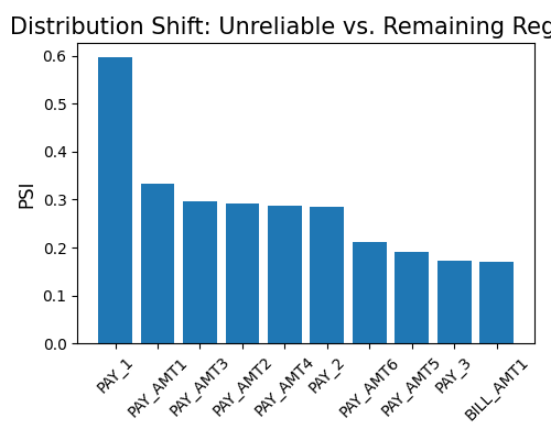
To obtain the distributional distance between reliable and unreliable data, set show to “reliability_distance”. It’s important to note that the alpha argument is not utilized for classifiers.
exp.model_diagnose(model="XGB2", show="reliability_distance",
                   threshold=1.1, distance_metric="PSI", figsize=(5, 4))
6.4.2.2. Marginal Bandwidth
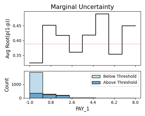
Similarly, the marginal bandwidth plot of each feature can be shown using the keyword “reliability_marginal”. We can further adjust the plot using arguments show_feature, threshold, and bins.
exp.model_diagnose(model="GAM", show="reliability_marginal",
                   show_feature="PAY_1", bins=10, threshold=1.1, figsize=(5, 4))
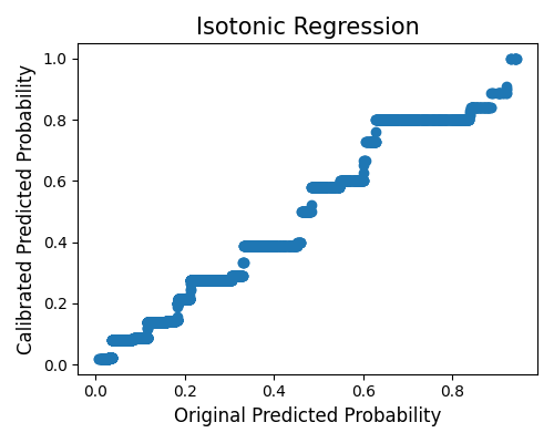
6.4.2.3. Classifier Calibration
In this plot, we do calibration of the estimator using isotonic regression. We can set show to “reliability_calibration” to get this plot. The x-axis is the original probability, and the y-axis is the calibrated probability.
exp.model_diagnose(model="GAM", show="reliability_calibration", figsize=(5, 4))
6.4.2.4. Reliability Diagram
A reliability diagram, also referred to as a calibration curve, discretizes the predicted probability into several bins using equal quantiles. The x-axis represents the mean predicted probability of each bin, while the y-axis represents the observed frequency of the true response within each bin. In an ideal scenario, the curve should closely align with the identity line. By setting show to “reliability_perf”, you can view the reliability diagram for both the original model and the calibrated model (using isotonic regression).
exp.model_diagnose(model="GAM", show="reliability_perf", figsize=(5, 4))
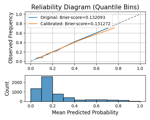
The Brier score is a metric that is analogous to the Mean Squared Error (MSE), and it is employed to assess the reliability of probability predictions. A lower Brier score indicates a better-performing model.
6.4.2.5. Brier Score Table
To get the Brier score individually, we can use the keyword “reliability_table”, as shown below.
results = exp.model_diagnose(model="GAM", show="reliability_table", return_data=True)
results.data