4.7. SHAP (SHapley Additive exPlanations)
SHAP (Shapley Additive Explanations; [Lundberg2017], [Lundberg2018]) is a machine learning tool that can explain the output of any model by computing the contribution of each feature to the final prediction. The concept of SHAP can be explained with a sports analogy. Suppose you have just won a soccer game and want to distribute a winner’s bonus fairly among the team members. You know that the five players who scored the goals played a significant role in the victory, but you also recognize that the team could not have won without the contributions of other players. To determine the individual value of each player, you need to consider their contribution in the context of the entire team. This is where Shapley values come in - they help to quantify the contribution of each player to the team’s success. For a detailed explanation of Shapley values and how they work, please refer to the IMLbook and SHAPBlog.
4.7.1. Algorithm Details
The Shapley value explanation method possesses several attractive properties, such as local accuracy, missingness, and consistency. It decomposes the prediction into a linear combination of feature contributions, as illustrated below.
where \(g\) is the explanation method, \(p\) is the number of features, and \(z^{\prime} \in \{0, 1\}^p\) is the coalition vector that indicates the on or off state of each feature. The Shapley value of the \(j\)-th feature is denoted as \(\phi_{j}\), which can be estimated using various approaches. In PiML, the Shapley values are computed based on the shap Python package, which offers several methods for estimating Shapley values. The following sections will introduce these estimation algorithms in detail. In particular, we use the `shap.Explainer` if the estimator is supported by the shap_ Python package. Otherwise, we will use the exact solution if the number of features is less than or equal to 15, and otherwise KernelSHAP.
4.7.1.1. Exact Solution
The exact solution is obtained using the Shapley value formula, which requires evaluating all possible coalitions of features with and without the \(i\)-th feature.
where \(val\) is the value function that returns the prediction of each coalition. The marginal contribution of feature \(i\) to the coalition \(S\) is calculated as the difference between the value of the coalition with the addition of feature \(i\) and the value of the original coalition, i.e., \(val(S \cup \{i\}) - val(S)\). The term \(\frac{|S|!(p-|S|-1)!}{p!}\) is a normalization factor. When the number of features is small, this exact estimation approach is acceptable. However, as the number of features increases, the exact solution may become problematic.
It’s worth noting that the value function \(val\) takes the feature coalition \(S\) as input. However, in machine learning models, the prediction is not solely based on the feature coalition but on the entire feature vector. Therefore, we need to specify how removing a feature from the feature vector affects the prediction. Two common approaches are available, both of which depend on a pre-defined background distribution instead of merely replacing the “missing” features with a fixed value.
The former conditions the set of features in the coalition and uses the remaining features to estimate the missing features, but it can be challenging to obtain the conditional expectation in practice. The latter approach breaks the dependency among features and intervenes directly on the missing features of the sample being explained, using corresponding features from the background sample. This approach is used in the KernelSHAP algorithm.
Conditional expectation: This approach conditions the set of features in the coalition and uses the remaining features to estimate the missing features. However, obtaining the conditional expectation can be challenging in practice.
Interventional conditional expectation (the option used in PiML): This approach breaks the dependency among features and intervenes directly on the missing features of the sample being explained, using corresponding features from the background sample.
4.7.1.2. KernelSHAP
KernelSHAP is a kernel-based approach for estimating Shapley values that are inspired by local surrogate models. It is particularly useful for computing Shapley values with a large number of features. Given an instance \(x\), KernelSHAP estimates the contributions of each feature using the following steps:
Randomly sample coalitions and compute the output of these simulated coalitions.
Calculate the weight of each feature in the coalition using the SHAP Kernel (see the details in the reference [Lundberg2017]).
Fit a weighted linear model to the sampled coalitions.
Return the Shapley values which are the coefficients of the linear model.
KernelSHAP ignores feature dependence. Sampling from the marginal distribution means ignoring the dependence structure between features, which may result in an estimation that puts too much weight on unlikely instances. Moreover, KernelSHAP is not guaranteed to be consistent with the exact solution, and it also requires a lot of computation time. In practice, we usually do downsampling to reduce the computation time (by default 500 in PiML).
4.7.1.3. Algorithms for specific models
In addition to exact solution and KernelSHAP, the shap package also provides specific estimation algorithms for certain models, e.g., LinearSHAP and TreeSHAP. The following paragraphs will introduce these algorithms in detail. However, most of the built-in models in PiML (except for TreeRegressor and TreeClassifier) do not benefit from these algorithms for the moment, and we instead use the exact solution or KernelSHAP.
LinearSHAP computes the SHAP values for a linear model and can account for the correlations among the input features.
Conditional expectation: Accounts for the correlation of features, and a subsample of data is used to estimate a transformation that can then be applied to explain any prediction of the model.
Interventional conditional expectation (default): Assumes features are independent, and the SHAP values for a linear model are \(coef * (x - \bar{x})\).
TreeSHAP is a model-specific algorithm designed for tree-based models. In decision trees, each leaf node explicitly defines a feature interaction, allowing interactions not present in the tree structure to be ignored and reducing the number of coalitions. This reduction in coalitions greatly reduces computation time for tree-based models. TreeSHAP offers two ways to compute Shapley values:
Path-dependent tree explainer, which approximates interventional conditional expectation based on the number of training samples that went down paths in the tree.
Interventional tree explainer (the default), which computes interventional conditional expectation exactly, but is a bit slower than the path-dependent method.
4.7.2. Usage
To do local explanations using SHAP in PiML, we’ll illustrate with the XGB2 model on BikeSharing data. For regression tasks, we’ll use the predicted value as the model output, and for binary classification tasks, we’ll use the predicted probability as the model output. The following code shows how to use the model_explain function to get various SHAP plots.
use_test: If True, the test data will be used to generate the explanations. Otherwise, the training data will be used. The default value is False.sample_id: The sample index in the train / test set, and the default value is 0. If use_test = True, the valid values is from 0 to test_sample_size - 1; otherwise, it ranges from 0 to train_sample_size - 1.sample_size: To speed up the computation, we subsample a subset of the data to calculate SHAP values. The default value is 500. To use the full data, you can setsample_sizeto be larger than the number of samples in the data.
4.7.2.1. The Waterfall plot
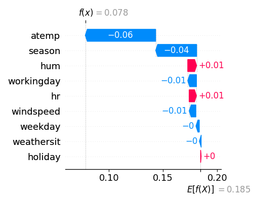
The Waterfall plot shows the Shapley values of a single sample point. It can be generated by setting the parameter show to “shap_waterfall”.
exp.model_explain(model="XGB2", show="shap_waterfall", sample_id=0, figsize=(5, 4))

In the waterfall plot, the y-axis displays the feature names, and the x-axis shows the contribution of each feature. For the first training sample (sample_id=0), the predicted output is denoted as \(f(x)\), while \(E(f(x))\) represents the average predicted output over the background data. In the example provided above, atemp has a SHAP value of -0.07 and contributes the most, followed by season, which has a SHAP value of -0.04, and so on.
4.7.2.2. SHAP Feature importance
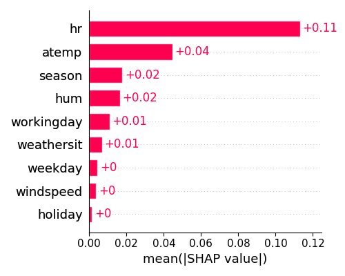
The SHAP feature importance plot provides a summary of the contribution of each feature over a set of samples. The importance of each feature is calculated by taking the average of the absolute Shapley values per feature across all samples, using the following formula:
To generate this plot, we set the argument show to “shap_fi” as shown below. As the calculation of Shapley values is time-consuming, we only use 100 samples (sample_size=100) to generate the plot for demonstration purposes.
exp.model_explain(model="XGB2", show="shap_fi", sample_size=100, figsize=(5, 4))

From the plot displayed above, it seems that hr has the highest level of importance, followed by atemp in second place.
4.7.2.3. SHAP Summary plot
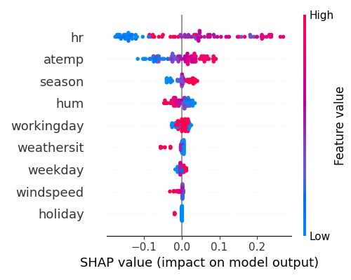
The summary plot, identified by the keyword “shap_summary,” displays the Shapley values of multiple samples. Similar to the feature importance plot, we also use 100 samples to generate the plot for demonstration purposes.
exp.model_explain(model="XGB2", show="shap_summary", original_scale=True, sample_size=100, figsize=(5, 4))

The summary plot, with feature names displayed on the y-axis and Shapley values on the x-axis, uses blue and red to indicate low and high feature values, respectively. The plot suggests that hr had the greatest impact on the model output, followed by atemp, season, and hum.
4.7.2.4. SHAP Dependence Plot
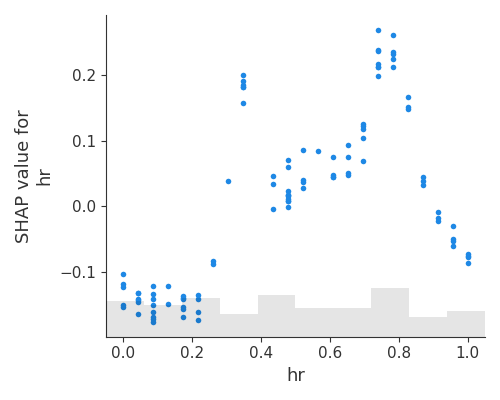
To display the relationship between a feature’s values and its Shapley values, use the SHAP dependence plot and set show to “shap_scatter” as shown below. Also, we draw the scatter plot using 100 samples.
exp.model_explain(model="XGB2", show="shap_scatter", uni_feature="hr",
                  sample_size=100,  original_scale=True, figsize=(5, 4))

This plot can be viewed as an alternative to PDP and ALE. In addition to the average effects, shown on the PDF and ALE, the SPAP dependence plot also shows the variance on the y-axis. The plot suggests that the Shapley values of hr are highly variable, and the model output is most sensitive to hr when hr is between 8 and 20.
