6.1. Accuracy
This section introduces how to utilize the model_diagnose function to evaluate model performance for regression and binary classification tasks. It’s important to note that all the metrics discussed here are based on the APIs provided by sklearn.
6.1.1. Regression Tasks
For regression tasks, PiML offers the following three metrics to evaluate model performance:
Mean Squared Error (MSE): It measures the average squared difference between the predicted and actual values. It provides a measure of the overall model performance, with lower values indicating better accuracy.
Mean Absolute Error (MAE): It calculates the average absolute difference between the predicted and actual values. It provides a measure of the average magnitude of errors, regardless of their direction.
R-squared (R2): This is a statistical measure that represents the proportion of the variance in the target variable that can be explained by the features in the model. Note that the value of R2 is always between 0 and 1 for the training set, with 1 indicating a perfect fit and 0 indicating no relationship between the variables. However, it is possible to have negative values for the testing set.
6.1.1.1. Accuracy Table
By setting show to “accuracy_table”, the function would generate a summary table for various metrics. The provided code below demonstrates the process of generating an accuracy table for a fitted XGB2 model using the BikeSharing dataset.
exp.model_diagnose(model="XGB2", show='accuracy_table')
| MSE | MAE | R2 | |
|---|---|---|---|
| Train | 0.0090 | 0.0669 | 0.7382 |
| Test | 0.0095 | 0.0688 | 0.7287 |
| Gap | 0.0005 | 0.0019 | -0.0095 |
This table displays performance metrics for both the train and test sets, along with the difference (gap) between these two sets. A desirable model exhibits a small MAE or MSE (approaching zero) and an R2 value close to 1. It is also important to minimize the gap between the train and test sets, as it indicates whether the model is overfitting.
6.1.1.2. Residual Plot
The residual is the disparity between the actual response and the predicted response values. A residual plot is employed to showcase the relationship between residuals and a specific feature. An ideal residual plot, known as the null residual plot, exhibits a random scattering of points forming a band of approximately constant width around the identity line. In PiML, we can generate residual plots for the testing set by configuring the show parameter as “residual_plot” and specifying the desired show_feature. The use_test argument, which is set to False by default (using the training set), can be set to True to generate the residual plot for the testing set.
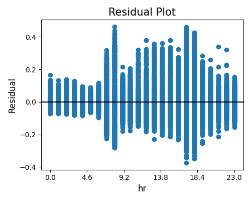
Numerical Features
The first example below displays the residual plot against a numerical feature hr. Upon examining the plot, it becomes evident that there is considerable variability in the residuals across different hours of the day. Notably, the range of residuals observed during rush hours is significantly wider than that of non-peak hours. This observation is logical since the demand for bike sharing is much higher during rush hours compared to non-peak hours, making predictions during rush hours relatively more challenging.
exp.model_diagnose(model="XGB2", show="accuracy_residual", show_feature="hr",
                   use_test=False, original_scale=True, figsize=(5, 4))
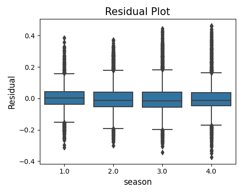
Categorical Features
The following example presents a bar chart residual plot for a categorical feature season. The plot illustrates that the residuals are evenly distributed across various seasons, which is a positive indication.
exp.model_diagnose(model="XGB2", show="accuracy_residual", show_feature="season",
                   use_test=False, original_scale=True, figsize=(5, 4))
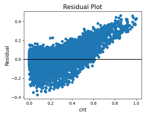
Target Feature
In addition to generating residual plots for input features, we can also generate residual plots against the target feature (cnt in the BikeSharing data). This allows us to assess the disparity in residuals across different values of the target. The resulting plot reveals a noticeable correlation between the residuals and the response, indicating that there may be a need for additional features to improve the model’s performance.
exp.model_diagnose(model="XGB2", show="accuracy_residual", show_feature="cnt",
                   use_test=False, figsize=(5, 4))
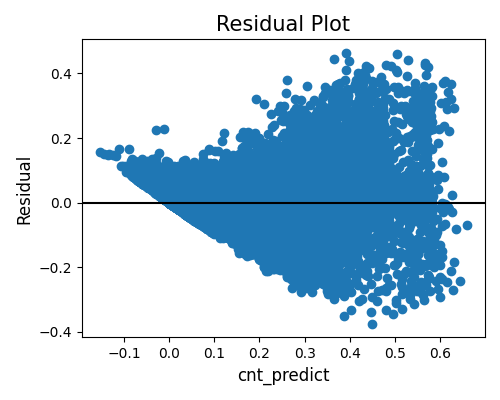
Predicted Value
Lastly, the residual plot against the predicted values is depicted below. To generate this plot, the show_feature argument should be set to the name of the response feature followed by “_predict”. From this plot, we can observe a positive relationship between the predicted values and the variability of residuals. This observation aligns with the earlier residual plot, indicating that predicting bike sharing during rush hours is more challenging than during non-peak hours. Furthermore, we notice that the scatter plot appears to be constrained at the lower end by the line \(x+y=0\). This boundary exists because the predicted values (\(x\)) plus the residuals (\(y\)) equal the response variable, and the minimum value for bike sharing is zero.
exp.model_diagnose(model="XGB2", show="accuracy_residual", show_feature="cnt_predict",
                   use_test=False, figsize=(5, 4))
6.1.2. Binary Classification
For binary classification tasks, the following metrics are supported:
Accuracy-score (ACC): The accuracy score is a commonly employed metric for evaluating classification models. It is calculated by dividing the number of correctly classified samples by the total number of samples. However, when working with imbalanced datasets, relying solely on accuracy may not provide an accurate assessment of model performance. In such cases, it is crucial to consider additional metrics such as AUC and F1-score to obtain a more comprehensive evaluation.
Area Under the ROC Curve (AUC): AUC provides a meaningful measure of how effectively the classifier distinguishes between positive and negative classes. Its values range from 0 to 1, where a model with completely incorrect predictions would have an AUC of 0.0, and a model with perfect predictions would have an AUC of 1.0. A random classifier, on the other hand, would have an AUC of approximately 0.5, indicating that its predictive ability is no better than random guessing.
F1-score (F1): The F1 score is calculated as the harmonic mean of precision and recall. The formula for computing the F1 score is as follows:
The F1 score combines both precision and recall into a single metric, providing a balanced measure of a classifier’s performance. By considering both precision (the ability to correctly identify positive instances) and recall (the ability to capture all positive instances), the F1 score offers a comprehensive evaluation of the model’s effectiveness in handling both true positives and false negatives.
Log loss (LogLOss): is also known as cross-entropy loss, which is a popular evaluation metric for binary classification problems. Log loss increases as the predicted probability diverges from the actual label.
Brier Score (Brier): is another metric commonly used to assess the performance of probabilistic predictions, particularly in the context of binary classification problems. It measures the mean squared difference between predicted probabilities and the actual outcomes. The Brier Score is defined as:
6.1.2.1. Accuracy Table
In a binary classification task, the accuracy table consists of three essential metrics: “ACC” (Accuracy), “AUC” (Area Under the ROC Curve), and “F1” (F1 Score). Here’s an example that demonstrates the usage of the accuracy table for a fitted XGB2 model on the TaiwanCredit dataset:
exp.model_diagnose(model="XGB2", show="accuracy_table")
The accuracy table for binary classification tasks follows a similar structure to that of regression tasks. By considering the values of “ACC,” “AUC,”, “F1,”, “LogLoss”, and “Brier”, as well as the “Gap” column, the accuracy table provides a comprehensive evaluation of the model’s performance in binary classification tasks.
6.1.2.2. Residual Plot
This plot displays the prediction residuals (between the target and the predicted probability) against a specific variable of interest. To generate this plot, we utilize the “residual_plot” option for the show parameter and specify the feature name of interest using the show_feature parameter. This plot shares similarities with the residual plots used in regression tasks, providing insights into the relationship between the residuals and the variable of interest. By examining this plot, we can analyze patterns and trends in the residuals and assess how they vary with changes in the selected feature.
exp.model_diagnose(model="XGB2", show="residual_plot", show_feature="PAY_1",
                   use_test=False, original_scale=True, figsize=(5, 4))
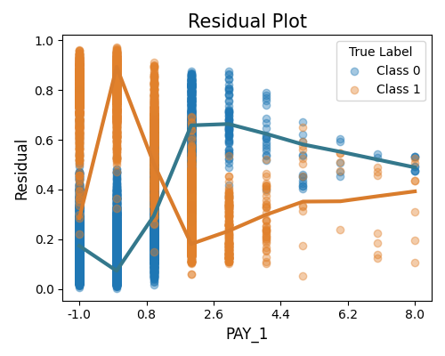
This plot illustrates the absolute difference between the predicted probability and the actual response (0 or 1). Since the response variable is binary, we plot the absolute residuals separately for class 0 and class 1. Additionally, we include smoothing curves for each class, which are estimated using the locally weighted scatterplot smoothing (Lowess) estimator.
It is important to note that the feature of interest in this plot can be either the input feature, the response variable, or the predicted probability. By examining this plot, we can gain insights into the magnitude and patterns of the absolute residuals for each class, allowing us to evaluate the model’s performance and identify any potential discrepancies between the predicted probabilities and the actual responses.
6.1.2.3. Accuracy Plot
To comprehensively evaluate the performance of a binary classification model, an additional plot can be generated by setting the show parameter to “accuracy_plot”. This plot comprises three subplots that depict the confusion matrix, ROC curve, and precision-recall curve for the testing set.
exp.model_diagnose(model="XGB2", show="accuracy_plot")
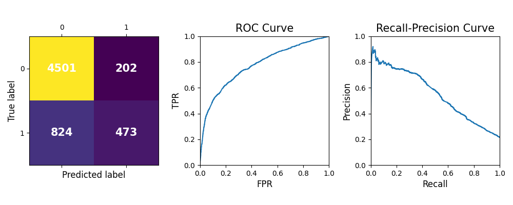
Confusion matrix: The left plot shows the confusion matrix, a valuable tool for evaluating classification model performance. The diagonal elements represent the number of instances where the predicted label matches the true label, indicating correct predictions. These values correspond to the true positives (TP) and true negatives (TN) of the model. On the other hand, the off-diagonal elements represent the mislabeled instances, including false positives (FP) and false negatives (FN). A higher value on the diagonal indicates better performance and more accurate predictions.
ROC curve: In the middle, the ROC curve illustrates the relationship between the true positive rate (TPR) and the false positive rate (FPR) at various threshold settings for classifying instances. The ROC curve can help determine the optimal threshold setting for the classifier by identifying the point on the curve that maximizes the TPR while minimizing the FPR. The closer the ROC curve is to the top-left corner of the plot, the better the classifier’s performance in terms of achieving higher sensitivity while maintaining a lower false positive rate.
Precision-recall curve: The right one displays the precision-recall curve, a useful measure for evaluating models when classes are imbalanced. High recall but low precision means that the model is correctly identifying a large number of positive instances (true positives), but it also includes many irrelevant instances. In contrast, low recall but high precision means that the model is correctly identifying a smaller proportion of positive instances (true positives), but the instances it identifies as positive are more likely to be true positives. This plot helps determine the optimal threshold for classifying instances and assessing the tradeoff between precision and recall.