5.6. XGBoost Depth 2
XGBoost depth 2 (XGB2) uses the XGBoost algorithm but with a maximum tree depth of 2. The model fitting process for XGB2 is the same as for raw XGBoost models. However, the main difference between XGB2 and XGBoost lies in their interpretation. In the context of functional ANOVA, an XGB2 model can be expressed as a GAM with pairwise interactions (GAMI). Once an XGB2 model is well-trained, we can extract the leaf node information from all the trees and restructure the model into an equivalent GAMI model.
where \(\mu\) is the global intercept, \(h_{j}(x_{j})\) is main effect, and \(f_{jk}(x_{j}, x_{k})\) is pairwise interaction.
Effects Aggregation. Once an XGB2 model is fit, we can extract the main effects and pairwise interactions by aggregating the leaf node information in the following way:
Leaf nodes with only one split variable correspond to the main effects.
Leaf nodes with two different split variables correspond to pairwise interactions.
Similar to XGB1, we can collect the unique splits for each feature or feature pair, and then calculate the accumulated leaf node values for each 1D or 2D bin generated by the unique splits.
Effects Purification. To ensure a unique representation of the GAMI model, we perform a purification step for each pairwise interaction by setting its conditional mean to zero. The removed effects are then added to their corresponding main effects. The iterative purification method proposed in [Lengerich2020] is used for this purpose. Given the 2D value matrix of a pairwise interaction \((j, k)\), the algorithm proceeds as follows:
Calculate the mean of \(\hat{f}_{jk}\) within each bin of the feature \(j\). Subtract the mean vector from the value matrix, and add the mean vector to the main effect \(\hat{h}_{j}\).
Calculate the mean of \(\hat{f}_{jk}\) within each bin of the feature \(k\). Subtract the mean vector from the value matrix, and add the mean vector to the main effect \(\hat{h}_{k}\).
Repeat the above steps until the value matrix converges. The final value matrix is the purified pairwise interaction \((j, k)\). Similarly, to ensure model identifiability, we also subtract the mean of each main effect, so that each main effect has zero means. The removed value is then added to the intercept term.
Empirically, XGB2 has demonstrated superior predictive performance over some black-box models. It can also be fitted with monotonicity constraints to make the model more interpretable. Additionally, we can prune some trivial effects to make the model more parsimonious.
5.6.1. Model Training
Here, we use the Bike Sharing dataset as an example to demonstrate the usage of the XGB2 model, as follows.
from piml.models import XGB2Regressor
exp.model_train(model=XGB2Regressor(), name="XGB2")
The XGB2Regressor (as well as XGB2Classifier) is a wrapper of the xgboost Python package and it inherits some commonly used hyperparameters in XGB, e.g., n_estimators, eta, tree_method, max_bin, gamma, reg_lambda, and reg_alpha.
Similar to XGB1, XGB2 supports monotonic constraints. For example, if you want to enforce the monotonic increasing constraint on the feature “hr”, then you can set mono_increasing_list=("hr"), also see the details here.
5.6.2. Global Interpretation
In addition to the main effect and feature importance plots in XGB1, XGB2 also supports interaction and effect importance plots.
5.6.2.1. Main Effect Plot
The main effect plot in XGB2 shows the estimated effect \(\hat{h}_{j}(x_{j})\) against the feature \(x_{j}\), represented as a piecewise constant function. In PiMl, users can use the “global_effect_plot” keyword to generate main effect plots for a particular feature by specifying its name in the uni_feature parameter.
exp.model_interpret(model="XGB2", show="global_effect_plot", uni_feature="atemp",
                    original_scale=True, figsize=(5, 4))
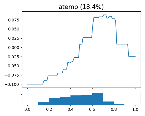
The plot illustrates the impact of the atemp feature (normalized feeling temperature in Celsius. The values are divided into 50) on bike sharing and includes its corresponding histogram. The data indicate that the peak of bike sharing activity occurs when atemp is around 0.7, which is considered a comfortable temperature for outdoor activities. Any temperature that is either cooler or hotter than this range tends to reduce people’s willingness to ride bicycles.
5.6.2.2. Interaction Plot
To visualize the estimated pairwise interaction, we can still use the keyword “global_effect_plot,” specifying the feature names in bi_features. The interaction plot shows the estimated interaction value matrix \(\hat{f}_{jk}(x_{j},x_{k})\) against \(x_{j}\) and \(x_{k}\).
exp.model_interpret(model="XGB2", show="global_effect_plot", bi_features=["hr", "season"],
                    sliced_line=False, original_scale=True, figsize=(5, 4))
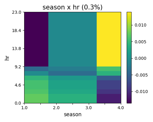
The estimated pairwise interaction between hr and season is shown in the figure above. Similar to two-way PDP and ALE, the interaction heatmap can be viewed via sliced 1D line plot, by setting sliced_line=True. (This is the same for all the GAMI models, including EBM, GAMI-Net)
5.6.2.3. Effect Importance
The effect importance is calculated as the variance of the estimated shape functions, which is similar to the feature importance in GAM. The effect importance can be calculated for both main effects and pairwise interactions. We use the keyword “global_ei” to draw the effect importance plot.
exp.model_interpret(model="XGB2", show="global_ei", figsize=(5, 4))
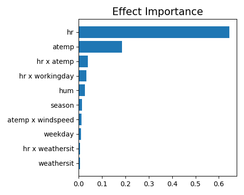
Here we only plot the top-10 effect importance. It can be observed that the main effect of hr is the most important, followed by atemp and the pairwise interaction between hr and workingday. Note that this plot only shows the top 10 effects with the largest importance. To get the full results, you can set the parameter return_data to True.
5.6.2.4. Feature Importance
The feature importance of XGB2 is different from that of GAM. Due to the existence of interaction effects, we need to aggregate the effects of each feature. This is done by summing the effects of each feature over the main effect and all related pairwise interactions.
Feature importance is calculated as the variance of \(\hat{z}_{j}(x_{j})\), then normalized such that they sum up to 1. Similarly, we use the keyword “global_fi” to draw the feature importance plot.
exp.model_interpret(model='XGB2', show="global_fi", figsize=(5, 4))
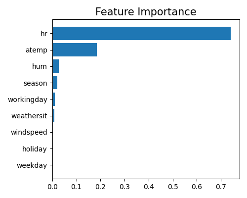
From this plot, we can observe that the two features hr and atemp take the dominant role in the model, followed by season and hum. Note that this plot only shows the top 10 features with the largest importance. To get the full results, you can set the parameter return_data to True.
5.6.3. Local Interpretation
As XGB2 is a GAMI model, its local interpretation consists of two parts: local feature contribution and local effect contribution. The local interpretation shows how the predicted value is formed by the main effects and pairwise interactions.
5.6.3.1. Local Effect Contribution
Given a sample, the local effect contribution displays the outputs of each main effect \(\hat{h}_{j}(x_{j})\) and pairwise interaction \(\hat{f}_{jk}(x_{j}, x_{k})\). In PiML, we use the keyword “local_ei” to draw the effect contribution of a sample specified by the sample_id parameter.
exp.model_interpret(model='XGB2', show="local_ei", sample_id=0, original_scale=True, figsize=(5, 4))
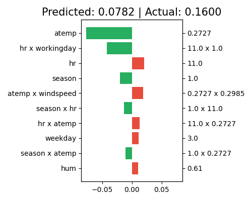
The predictor values of each effect are shown on the right axis, and the corresponding effect names are shown on the left axis. From the title, we can see that the predicted value of this sample is 0.0606, which is slightly different from the actual response of 0.16. The predicted value 0.0606 is then additively decomposed as the summation of all effect contributions plus the intercept term (not shown in this plot). The main effect of atemp contributes the most to the final prediction, with a negative contribution (around -0.06). Followed by atemp, the main effect of season and the pairwise interaction (hr, workingday) also show negative contributions to the final prediction. Note that this plot only shows the top 10 effects with the largest contribution. To get the full results, you can set the parameter return_data to True.
5.6.3.2. Local Feature Contribution
The local feature contribution plot shows the aggregated local effect contribution of each feature. This is done by summing the local effect contribution of each feature over the main effect and all related pairwise interactions, i.e., \(\hat{z}_{j}(x_{j})\). To draw the local feature contribution plot, we use the keyword “local_fi”.
exp.model_interpret(model="XGB2", show="local_fi", sample_id=0, original_scale=True, figsize=(5, 4))
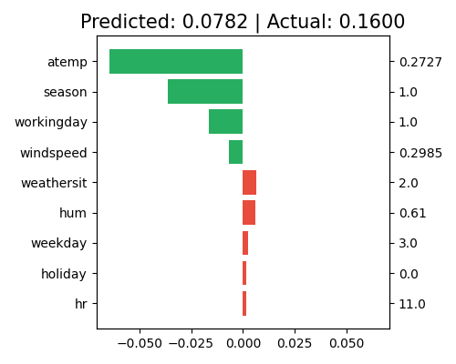
The interpretation of the feature contribution plot is similar to that of the local effect contribution plot, except that the contribution is shown by feature instead of effect. For this specific sample, the main effect of atemp and season still negatively contribute to the final prediction. In contrast to the positive contribution of its main effect, the feature hr shows a negative contribution from the feature level. Note that this plot only shows the top 10 features with the largest contribution. To get the full results, you can set the parameter return_data to True.
